How to Mix Colours Like a Professional Artist: A Complete Guide to Colour Mixing
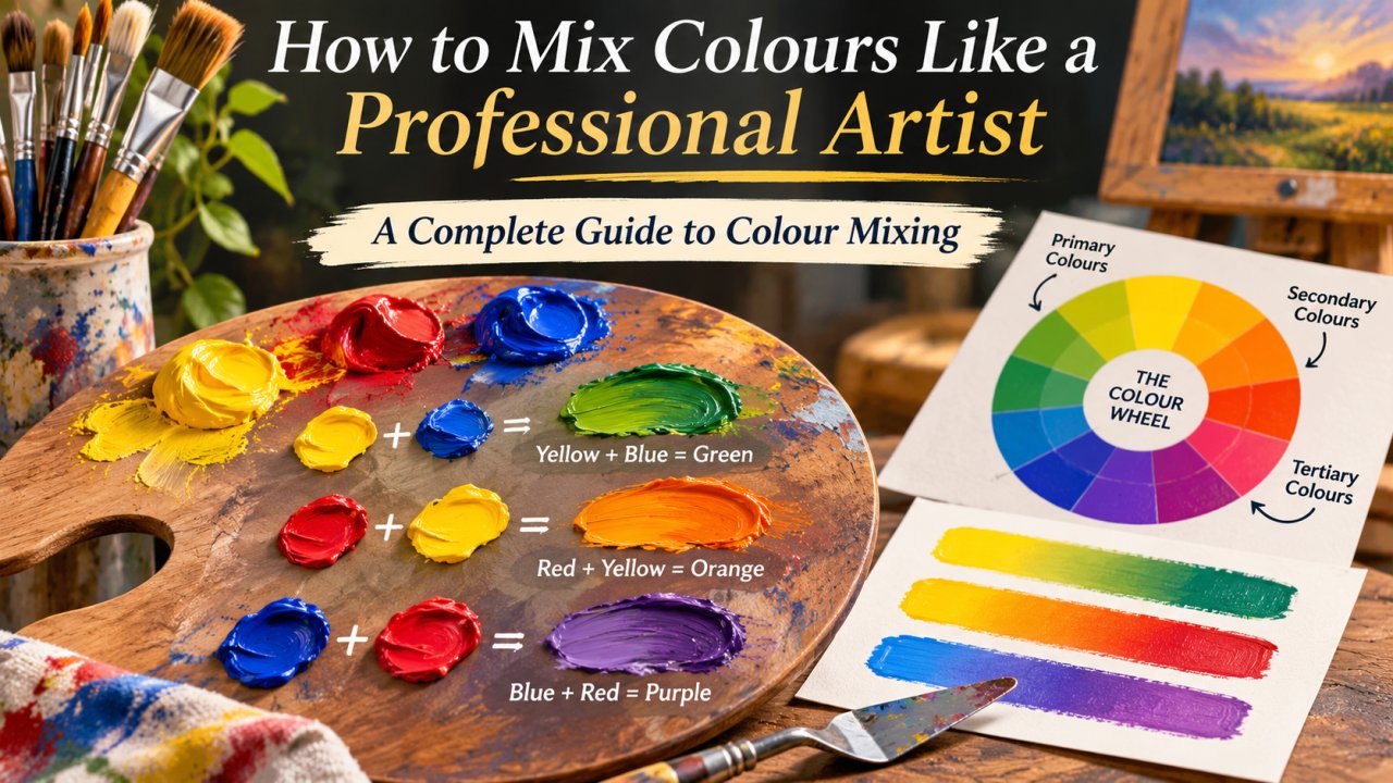
Learning how to mix colour is one of the most valuable skills an artist can develop. Whether you are painting landscapes, portraits, abstract artwork, or decorative pieces, understanding colour mixing helps you create beautiful shades without purchasing dozens of different paints.
Professional artists do not simply combine random colours. They understand colour relationships, pigment behaviour, temperature, and balance. This complete colour mixing guide explains how to mix paint colours, create custom shades, and use colour theory to achieve more natural, consistent results.
Understanding the Basics of Colour Mixing
Colour mixing is the process of combining two or more paint colours to create a different shade. It allows artists to develop unique colour combinations, control brightness, and achieve the desired appearance in their paintings.
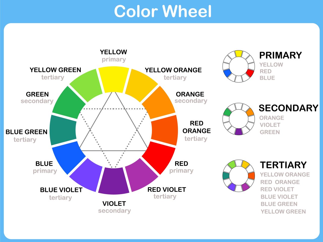
Before learning how to mix colour like a professional, it is important to understand three basic colour categories: primary, secondary, and tertiary colours.
Primary Colours
In traditional painting lessons, the three primary colours are:
- Red: Commonly used to create oranges, purples, and warm mixtures.
- Yellow: Essential for mixing greens, oranges, and earthy shades.
- Blue: Used to develop greens, violets, and cooler colour mixtures.
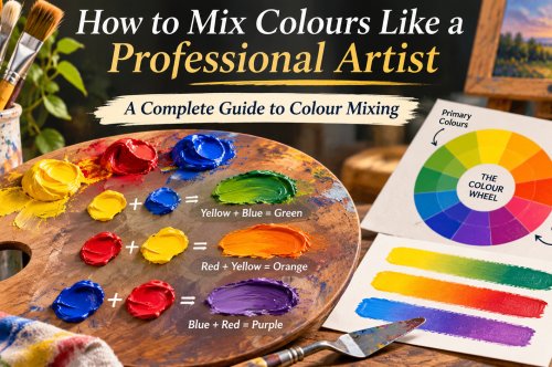
These colours form the foundation of the traditional RYB colour wheel. However, real paint pigments behave differently depending on their composition, so not every red, yellow, and blue combination produces equally vibrant results.
Secondary Colours
Secondary colours are created by combining two primary colours.
|
Colour Combination |
Result |
|
Red + Yellow |
Orange |
|
Blue + Yellow |
Green |
|
Red + Blue |
Purple or Violet |
The exact outcome depends on the pigments used and their proportions. For example, a warm yellow mixed with a reddish blue may produce a muted green rather than a bright one.
Tertiary Colours
Tertiary colours are traditionally formed by mixing a primary colour with a neighbouring secondary colour.
Examples include red-orange, yellow-orange, yellow-green, blue-green, blue-violet, and red-violet.
Understanding these combinations makes it easier to predict how colours will interact when creating more advanced artwork.
How to Mix Colours to Make Other Colours
If you are wondering how to mix colour using basic paints, start with small quantities and gradually adjust the proportions. This prevents unnecessary paint waste and gives you better control over the final result.
The following colour mixing chart provides useful starting combinations for beginners.
Basic Paint Colour Mixing Chart
|
Desired Colour |
Colours to Mix |
|
Orange |
Red + Yellow |
|
Green |
Blue + Yellow |
|
Purple |
Red + Blue |
|
Pink |
Red + White |
|
Light Blue |
Blue + White |
|
Peach |
Orange + White |
|
Brown |
Orange + Blue |
|
Turquoise |
Blue + Green, adjusted with White |
|
Olive Green |
Green + a small amount of Red |
|
Lavender |
Violet + White |
|
Grey |
Black + White |
|
Dark Maroon |
Red + a small amount of Green or Blue |
These combinations are starting points rather than fixed formulas. Different paint brands and pigments can produce noticeably different colours, even when the mixing ratios remain unchanged.
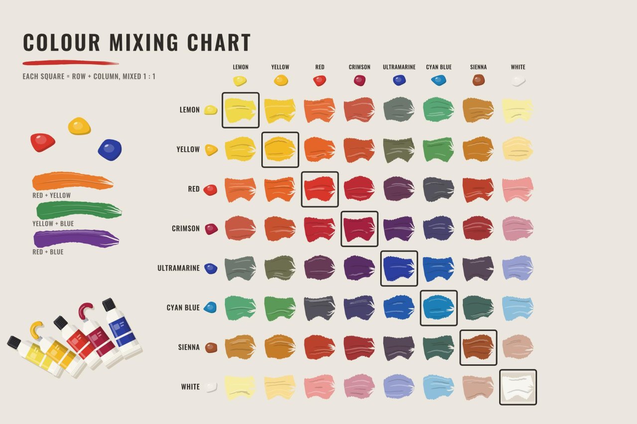
Professional tip: Add darker or stronger pigments gradually into lighter colours. Highly concentrated pigments can change a mixture quickly, making precise adjustments more difficult.
Understanding the Colour Wheel for Artists
A colour wheel is a visual guide that organises colours according to their relationships. It helps artists choose colours that work together and understand which mixtures produce contrasting or harmonious results.
When learning how to mix colour, the colour wheel becomes especially useful for planning artwork, adjusting colour temperature, and identifying complementary colour combinations.
Complementary Colour Combinations
Complementary colours appear opposite each other on a traditional colour wheel.
Common examples include:
- Red and Green
- Blue and Orange
- Yellow and Purple
Placing complementary colours next to each other creates strong visual contrast. Mixing them together generally reduces saturation, producing muted browns, greys, or darker neutral colours.
Analogous Colour Schemes
Analogous colours sit next to each other on the colour wheel.
Examples include blue, blue-green, and green, or yellow, yellow-orange, and orange.
These combinations create smooth transitions and a sense of colour harmony in painting. Artists frequently use analogous schemes in landscapes, floral artwork, and atmospheric backgrounds.
Warm and Cool Colours in Art
Understanding colour temperature is essential when learning how to mix colour professionally. Colours are often described as warm or cool based on their visual characteristics and relationships with surrounding colours.
Warm colours generally include red, orange, and yellow. They can communicate energy, warmth, excitement, and sunlight.
Cool colours generally include blue, green, and violet. They are often associated with calmness, distance, water, and shadows.
However, individual paint colours can also have warm or cool undertones. For example, ultramarine blue leans towards violet, while phthalo blue green shade leans towards green.
This difference is known as colour bias.
According to Winsor & Newton's guide to warm and cool colours, temperature is relative and depends partly on neighbouring colours.
Artists can use these relationships to create depth, atmosphere, and more realistic colour combinations.
Professional Colour Mixing Techniques Every Artist Should Know
Professional painting techniques go beyond combining primary colours. They involve controlling colour value, saturation, transparency, and temperature to achieve the intended effect.
1. Start With a Limited Colour Palette
Instead of using too many paints, begin with a small selection of primary mixing colours, white, and a few useful earth pigments.
A limited palette encourages better understanding of pigment relationships and helps maintain consistency throughout a painting.
2. Understand Tint, Shade, and Tone
Tint, shade, and tone are essential concepts in basic colour theory for artists.
- Tint: A colour made lighter by adding white.
- Shade: A colour made darker by adding black.
- Tone: A colour made less intense by adding grey, in a common introductory definition.
Artists can also darken or neutralise mixtures using complementary colours, often producing more interesting results than black alone.
3. Control Colour Value and Saturation
Value describes how light or dark a colour appears. Saturation, sometimes called chroma, describes its intensity or purity.
A painting with accurate values can look realistic even when its colours are simplified.
To improve your painting, compare light and dark areas before making fine colour adjustments.
4. Mix Colours Gradually
One of the most practical colour mixing tips for beginners is to add pigments in small amounts.
Start with the dominant colour and slowly introduce other pigments. Test each mixture on spare paper or canvas before applying it to your artwork.
5. Record Your Colour Recipes
Keep a colour mixing journal containing paint names, approximate ratios, and dried samples.
This simple practice makes it easier to recreate custom paint shades and develop a consistent personal colour palette.
How to Mix Paint Colours for Different Painting Mediums
The process of mixing colours changes slightly depending on whether you are working with acrylic, watercolour, or oil paint.
Acrylic Painting
Acrylic paint dries relatively quickly, making it suitable for beginners and artists who enjoy layering.
For acrylic colour mixing:
- Prepare your mixtures before painting large areas.
- Use a palette knife for even mixing.
- Add appropriate acrylic medium when more working time is required.
- Test colours after drying, as their appearance may change.
Watercolour Painting
Watercolour painting depends heavily on transparency and the white surface of the paper.
Rather than adding white paint, artists commonly use more water to create lighter washes.
For cleaner mixtures, combine transparent pigments carefully and avoid repeatedly disturbing colours while they are drying.
Oil Painting
Oil paints generally provide more working time, allowing artists to blend colours gradually.
Use a palette knife to combine pigments and build colour relationships before applying them to the canvas.
Remember that drying time and paint handling vary depending on the pigments and medium.
Creating Natural Skin Tones With Paint
Natural skin tone mixing requires more than combining white and brown. Human skin contains subtle variations of red, yellow, blue, and neutral pigments.
When learning how to mix colour for portrait painting, start with an approximate base tone and adjust it according to your reference.
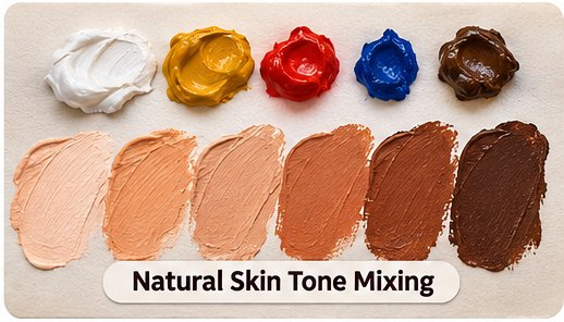
A simple starting method is:
- Mix yellow ochre with a small amount of red or burnt sienna.
- Add white when working with opaque paints to lighten the mixture.
- Introduce a tiny amount of blue to reduce excessive warmth.
- Adjust the mixture for highlights, shadows, and reflected light.
Avoid using one flat colour across an entire portrait. Observing changes in value, temperature, and surrounding light creates more convincing results.
How to Create Earth Tone Colour Palettes
Earth tones are widely used in landscape painting, portraits, interiors, and natural artwork. They include browns, muted greens, ochres, terracotta, and warm greys.
To create an earth tone colour palette, experiment with the following mixtures:
- Warm Brown: Orange mixed with a small amount of blue.
- Olive Green: Green neutralised with a little red.
- Terracotta: Orange-red mixed with a small amount of blue.
- Muted Yellow: Yellow mixed with a small amount of violet.
- Warm Grey: Blue and orange mixed towards a neutral, then lightened as needed.
The precise outcome depends on pigment strength and colour bias.
For a deeper understanding of pigment combinations, explore the GOLDEN Artist Colors mixing guide, which explains how professional acrylic pigments interact.
Common Colour Mixing Mistakes to Avoid
Even experienced artists occasionally struggle with colour mixing. Most problems arise from incorrect pigment selection, uncontrolled proportions, or insufficient understanding of colour relationships.
Adding Too Many Colours
Combining several different pigments can create dull or muddy mixtures.
Use the fewest colours necessary and introduce additional pigments only when the mixture needs adjustment.
Using Black to Darken Every Colour
Black can reduce brightness and sometimes change the apparent temperature of a mixture.
Try a complementary colour or a darker version of the same hue when you want more natural-looking shadows.
Ignoring Pigment Undertones
Not all reds, blues, and yellows behave identically.
Choosing pigments with suitable colour bias helps create cleaner greens, oranges, and violets.
Mixing Without Testing
Wet paint can look different after drying. Always test your mixture on the same type of surface used for your artwork.
These precautions make learning how to mix colour easier and help prevent unnecessary material waste.
Practical Colour Mixing Exercises for Beginners
Regular practice is the best way to improve your colour mixing techniques.
Try these three exercises to strengthen your understanding.
Exercise 1: Create a Colour Wheel
Use red, yellow, and blue to create secondary and tertiary colours. Label each mixture and observe how the colours change when proportions are adjusted.
Exercise 2: Make a Value Scale
Choose one colour and create five to seven variations from light to dark. Focus on controlling value rather than changing the basic hue.
Exercise 3: Recreate Colours From Nature
Select a leaf, flower, stone, or photograph and attempt to match its colours using a limited palette.
This exercise helps you recognise subtle colour relationships and develop better observational skills.
Frequently Asked Questions About Colour Mixing
How to mix colour for beginners?
Start with red, yellow, and blue paints, along with white. Mix two colours in small amounts, observe the results, and adjust the ratios gradually. Practising with a colour wheel is an effective way to learn basic paint combinations.
How do you mix primary colours to create new colours?
In traditional colour theory, red and yellow make orange, yellow and blue make green, and red and blue make violet. Actual results depend on the specific paint pigments used.
How can artists make colours brighter?
Choose suitable high-chroma pigments, avoid excessive mixing, and use clean tools. For brighter secondary colours, select primary pigments with compatible colour bias.
How do you create custom paint shades?
Begin with a base colour, then gradually adjust its value, temperature, and saturation. Record pigment names and proportions so that successful mixtures can be recreated later.
What is the easiest way to learn colour theory in painting?
Begin by studying the colour wheel, primary and secondary colours, complementary combinations, and warm and cool relationships. Apply these concepts through simple mixing exercises rather than memorising colour formulas alone.
Why do mixed paint colours sometimes look muddy?
Muddy colours often result from combining pigments that neutralise each other or from excessive mixing. Understanding complementary relationships and pigment bias helps artists control muted colours intentionally.
Conclusion
Mastering how to mix colour takes observation, patience, and consistent practice. By understanding primary and secondary colours, using the colour wheel, experimenting with warm and cool pigments, and applying professional colour mixing techniques, artists can create a wide range of beautiful shades.
Whether you are a beginner exploring basic colour theory or an experienced painter refining your technique, developing strong colour mixing skills will give you greater creative freedom and confidence in every painting.
Start with a limited palette, experiment with combinations, and keep a record of the shades you create. Over time, choosing and mixing the right colours will become a natural part of your artistic process.